
Farewell to the Macintosh HD Icon: 2000–2025
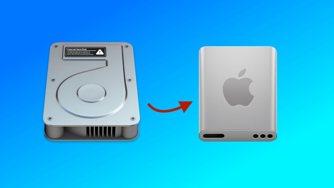
The release of macOS 26 Tahoe has brought with it a nostalgic farewell to the familiar Macintosh HD hard drive icon, which has served Mac users since 2000. Now replaced by an icon resembling a solid-state drive (SSD), this change is a nod to the evolution of storage technology, even if the new icon takes some creative liberties in its design.
Over the years, the visibility of the Macintosh HD icon has diminished. Recent macOS installations default to not displaying the internal disk on the desktop, reflecting Apple's shift to SSDs in newer models. The timing of this icon update is puzzling as Apple transitioned to SSDs years ago, but the change is certainly logical.
The original icon debuted with Mac OS X and remained relatively unchanged until it received a Retina resolution upgrade in 2012, followed by a subtle redesign in macOS Yosemite in 2014. This facelift was part of a broader move away from pseudo-realistic textures, a significant design objective of that period.
MacOS 26 Tahoe not only revamps the Macintosh HD icon but also updates other icons such as those for external drives, network shares, and removable disk images, in line with the shift toward uniformity and clarity.
The evolution from HDD to SSD in Apple devices began in 2008 with the MacBook Air, accelerating with the introduction of 'Retina' Macs in the 2010s, and culminating in Apple's complete transition from spinning hard drives with the discontinuation of Intel-based iMacs.
While the aesthetics of storage icons may seem trivial, they hold a symbolic weight in the tech community. The departure of the classic Macintosh HD icon marks the end of an era. Though neither the old nor the new icon perfectly resemble the physical storage components within modern Macs, they serve as a bridge across decades of technological advancement. Goodbye, Macintosh HD icon. You will be remembered fondly.